Ecoseptic
Mapping the needs
Ecoseptic turned to me for a website and as always I started out by arranging a meeting so I could understand their needs and goals. I asked them what they needed the page for and offered advice to take their ideas to the next level so that the website helps them not vice versa. Additionally I gauged their budged so I wouldn't shoot myself into the foot by promising them stars and the moon.
How that culminated...
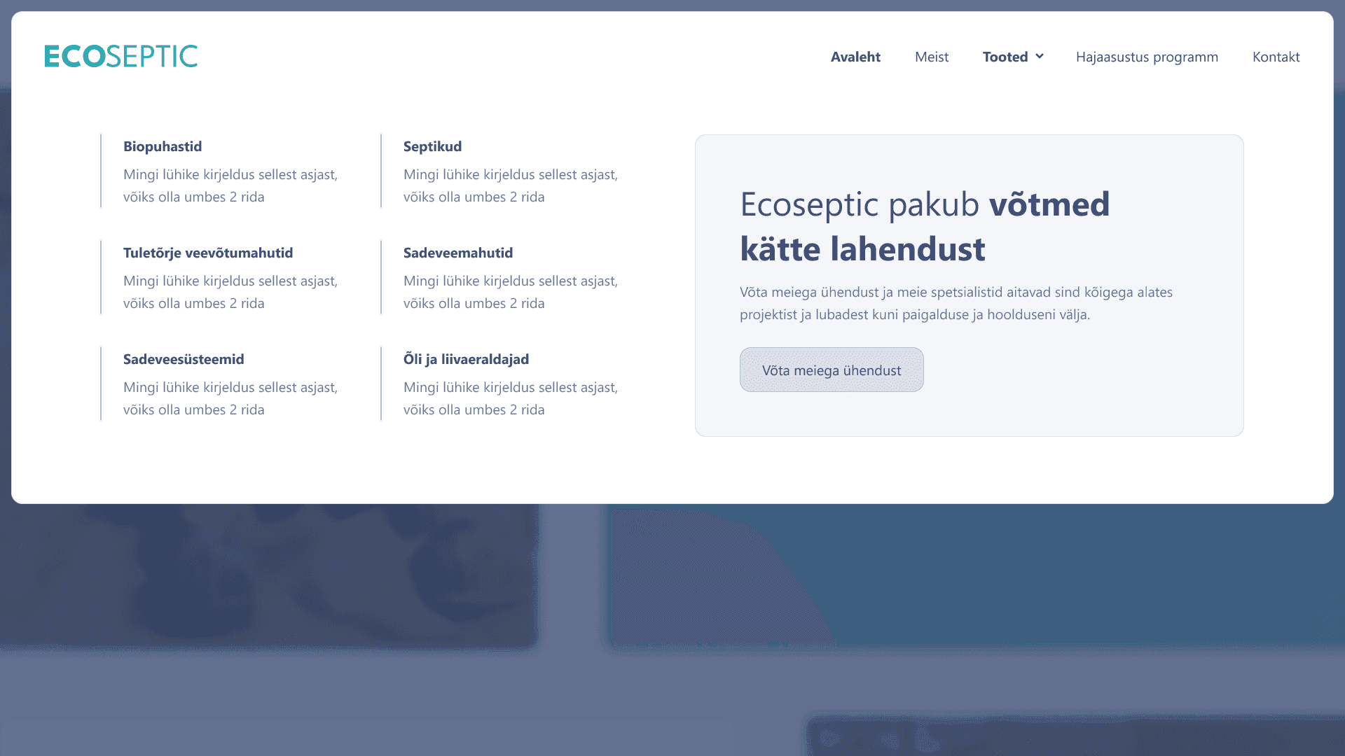
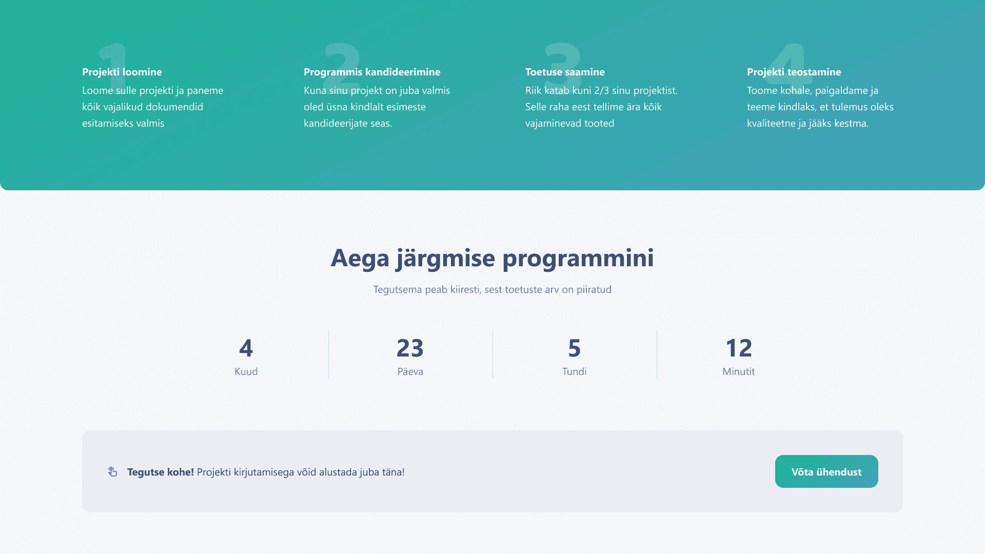
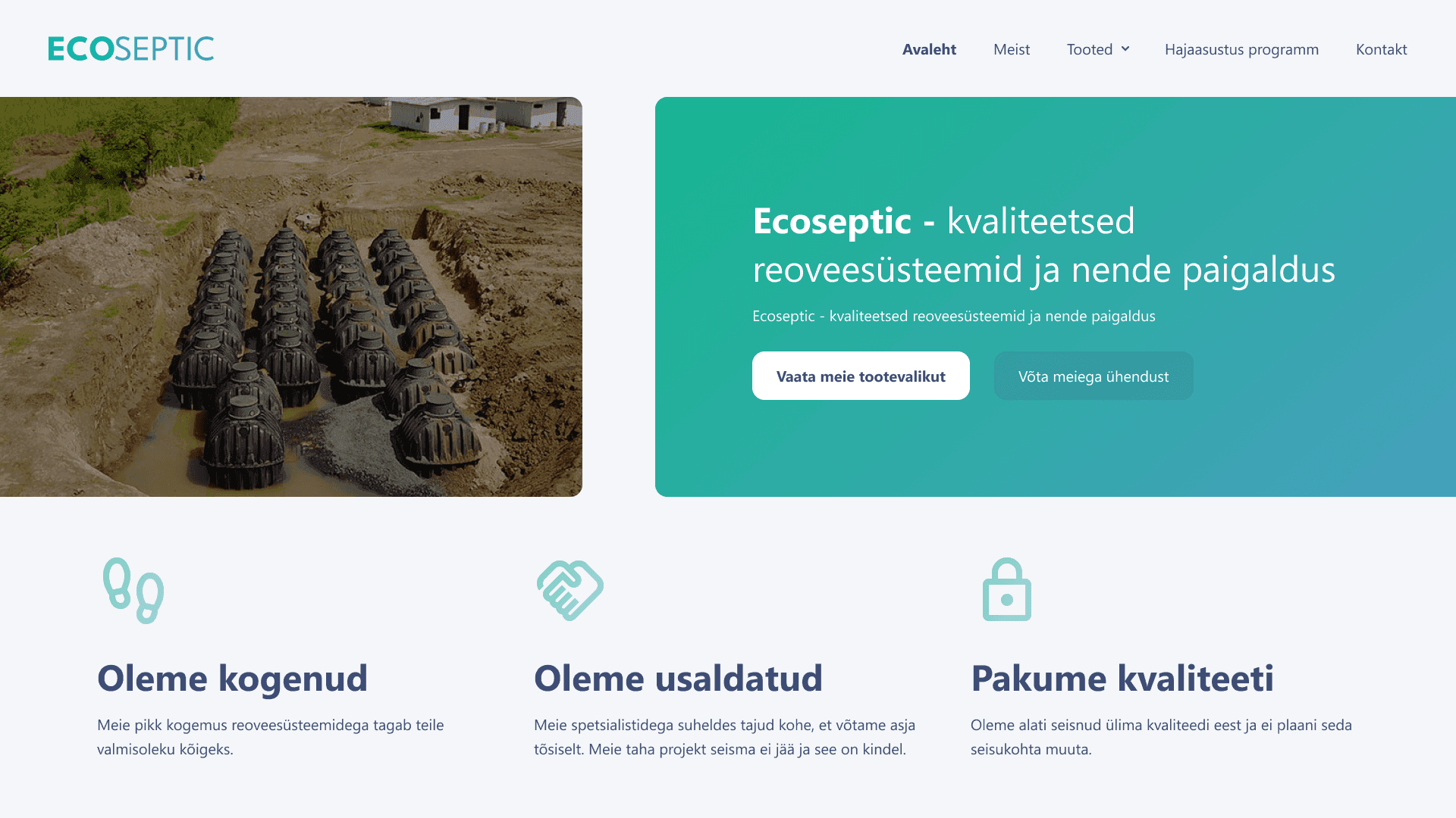
They needed a simple storefront for small amounts of products, but that should strongly be connected to their construction service. Their primary selling argument is their comprehensive project-to-finalization service. Additionally they could increase the sales by helping the clients apply for funding from the government. That should be made simple as the funding varies county to county.
Process
I initiated the project with two things. First I worked out the structure of the website and wrote down where, what and why. That could help me see bigger picture before diving into the details. Secondly I worked on the visual identity. I offered prototypes to get on the same page with the client. It was quite simple with Ecoseptic. They had concrete examples of what they would like to see. If the general style was found I defined all the colors, fonts and illustrative elements.
If plan was done I built a prototype that I tested on my partners and friends. It was not really an official UX test, but gave me some intel on the general vibe of the project, but I didn't see the need for it either as the project was built upon rather simple and standard UI patterns.
I offered taking some photos to them, but they told me that they will do that later by themselves. That day has not yet come.
To save budget for development I didn't do mobile views (sacrilege right?), but instead covered the design with notes to my long term development partner with whom we have developed a design standard we both understand.